


As a website designer, the number one question I get from people is, “What should I write on the homepage of my website?”
Your homepage is your first impression— it needs to be clear, simple, and compelling! If a visitor doesn’t immediately understand what you do and how you can help them, they will leave! Seriously– 75% of website visitors judge your business’s credibility based on your website design, and will leave within 3 seconds if the website doesn’t load quickly. This means that most website visitors will leave within 3 seconds (and not scroll down past the hero image on the top of the page to even look at your amazing services or products).
So, yes- your homepage couldn’t be more important! Here’s exactly what you should put on your website homepage.
What should I write on the homepage of my website? Must have elements and messaging
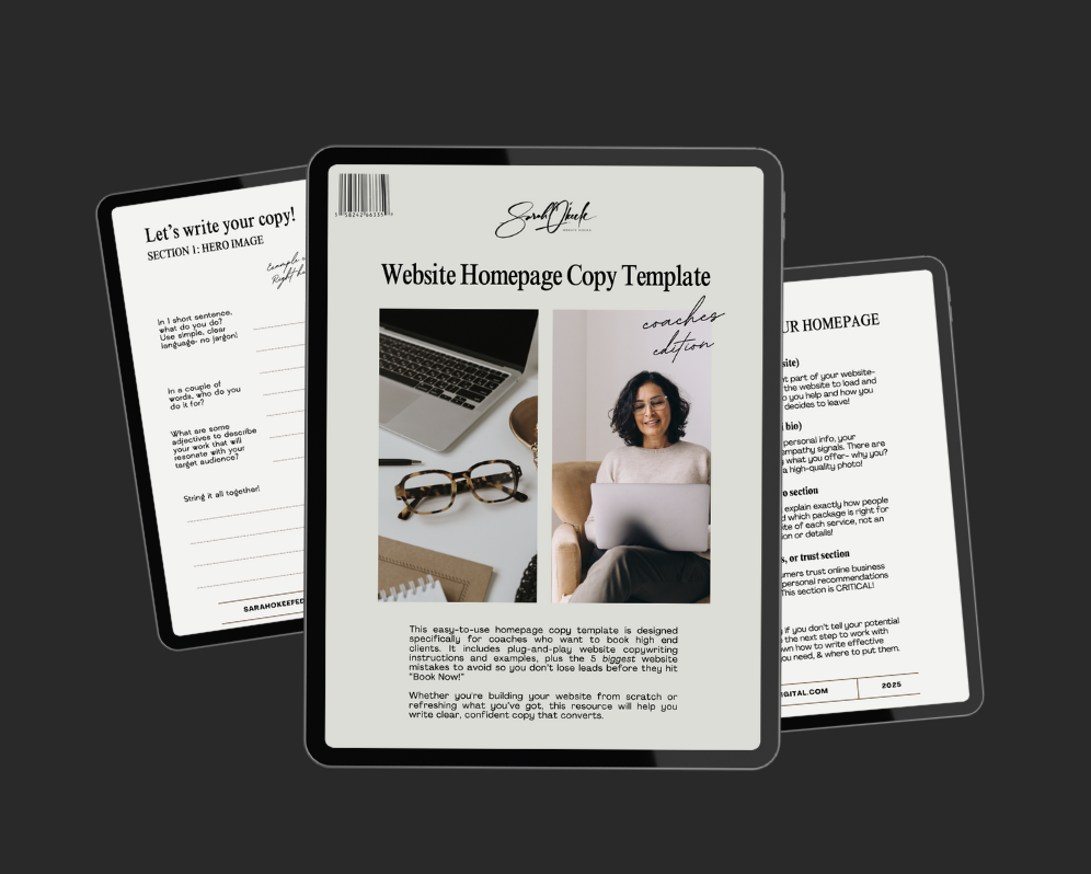
Here’s the list, point by point! But if you want a little more help, be sure to snag my Website Homepage Copy Writing Template! It has fill in the blank prompts and examples for you to absolutely NAIL your homepage messaging.
👉 Get it here, completely free!
1. A clear and impactful hero section
The hero section (the top of your homepage) is prime real estate. Within seconds, visitors should know exactly what your business does and who it’s for. Avoid jargon and clever but vague taglines—this is not the place to be poetic. Instead, be direct and concise.
✅ Good (clear & plain language):
“We design conversion-focused websites for women entrepreneurs.”
❌ Bad example (business jargon & confusion):
“Leveraging digital ecosystems to optimize brand engagement and scalability.”
Your hero section should also include a compelling call-to-action (CTA) like “Book a free consultation” or “Get your free website audit” to guide users toward the next step.
2. A concise and powerful value proposition
Right below your hero section, reinforce what makes your business unique and why visitors should care. Keep it short and customer-focused.
✅ “We help small businesses grow with beautifully designed websites that convert visitors into customers.”
❌ “Our innovative and dynamic approach to web design ensures an optimized digital presence.” (Too vague!)
3. Clear navigation & user-friendly layout
Your homepage should act as a roadmap to the rest of your website. Keep your navigation simple—no more than 5-6 options.
example: home | about | services | portfolio | blog | contact
4. Social proof & trust signals
People trust other people. Include testimonials, reviews, or logos of brands you’ve worked with to establish credibility.
✅ “Sarah completely transformed my website! My inquiries doubled within a month.” – Jane, small business owner
5. A quick overview of services or offerings
Provide a brief, scannable list of what you do with links to learn more.
6. A clear call-to-action (cta)
Don’t leave visitors guessing what to do next! Use buttons that stand out with color contrast and irresistible copy!
✅ “Schedule a FREE consultation”
✅ “I’m ready to change my life”
Common website homepage mistakes to avoid
Confusing messaging – If a visitor can’t instantly understand what you do, they’ll leave.
Too much text – Keep it concise. People skim, they don’t read walls of text.
No clear call-to-action – If there’s no obvious next step, visitors won’t take one.
Slow loading speed – If your site takes more than 3 seconds to load, you’ll lose visitors.
Cluttered design – Too many colors, fonts, or elements create confusion.
Your homepage should be clear, simple, and focused on your audience. The goal is to make it effortless for visitors to understand what you do and take action. Keep it clean, remove unnecessary fluff, and guide your users toward working with you.
Need help crafting a homepage that converts? Let’s chat! SO Digital is a USA-based, women-owned website design agency in Arlington, Virginia. We build show-stopping, strategic websites for entrepreneurs and small businesses who want to turn passion into profit. Check out our affordable, all-inclusive Website in a Day and Website in a Week packages to start turning clicks into clients!


